by Philipp Fröhlich
Between 1966 and 1970, Barnett Newman, a prominent figure in abstract expressionism, painted four versions of a painting he called ‘Who’s Afraid of Red, Yellow and Blue’ (above). I assume Newman foresaw the intimidating effect that the large-scale combination of the three primary colours as colour fields could have, as two of the paintings have since been attacked and partially destroyed by vandals.
Recently, I’ve come across discussions on Permanent Style mentioning the colour wheel and its potential applications in clothing. As a painter myself, I thought I could share some insights based on my experience.
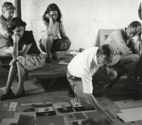
Joseph Albers, a painter and educator at the renowned Bauhaus academy, published an exceptional book at Yale University Press in 1963, featuring 150 colour experiments. He asserted that: “In visual perception a colour is almost never seen as it really is – as it physically is. This fact makes colour the most relative medium in art. In order to use colour effectively, it is necessary to recognise that colour deceives continually.”
Albers distinguished factual colour (colour in isolation) from actual colour (colour in context). Similarly, I believe we should emphasise contrast rather than isolated colour in regards to clothing. Of course, discussing factual colour in clothing is impossible anyway given things like skin tone, hair colour, eye colour and surroundings always come into play. I suppose the traditional division between country and city clothes has its roots here, too.
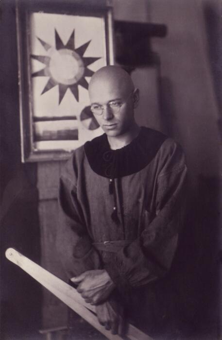
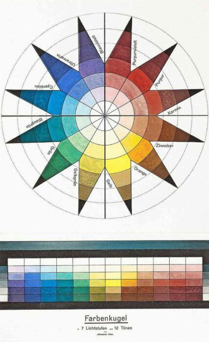
Johannes Itten, a Swiss painter and theorist, also a professor at the Bauhaus school, defined seven different colour contrasts. Let’s look at some of them – several have useful applications to how we dress.
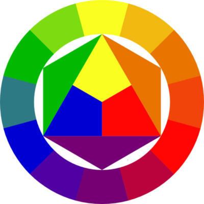
The colour wheel, likely familiar from physics or arts classes, comprises the three basic colours: red, yellow, and blue, arranged in a triangle with their respective mixtures in between, resulting in orange, purple, and green (at the most basic level).
The contrast between opposite colours in the circle, such as red and green, is called complementary and is regarded as particularly strong. Each of these tones heightens the effect of the other: green makes red look even more vibrant and vice versa.
Strong colours are always hard to wear
In a recent post and comment, there was a suggestion that this contrast might not be as suitable for menswear as the contrast of neighbouring colours on the wheel. However, I disagree.
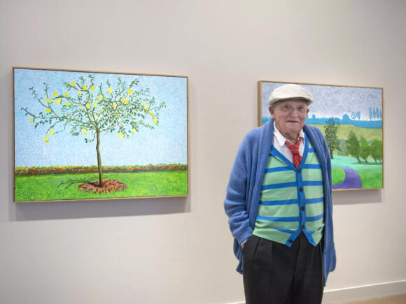
Any two equally strong colours placed next to each other create a contrast that is only for the bold. David Hockney effectively employs neighbouring colours in his paintings and clothing, achieving an effective, but highly stylised and slightly aggressive pop-art aesthetic.
But this applies equally to complementary colours as it does to those that sit next to each other on the colour wheel, as long as they are all equally strong.
Grey conjures up the complementary colour
That’s complementary contrast. The second type is simultaneous contrast.
Here, placing a strong red near a grey causes the red to conjure up its contrasting green tone in the grey, within our retina. You often see this in menswear, when for example a grey flannel suit is worn with a denim workwear shirt or green polo shirt. In these combinations, the neutral grey assumes the role of the contrasting colour, albeit in a very slight way that balances out the harmony.



Black and white can separate colours
You might think that black and white could perform this function in the same way as grey, but this is only true to a certain extent.
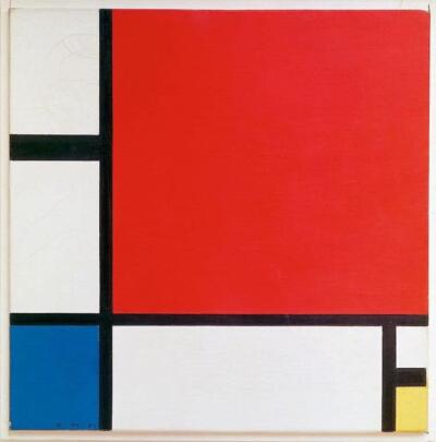
Black and white often work more as a separator. While artist Piet Mondrian used the three basic colours in his colour field arrangements, just like Newman, the grid-like black and white structures change the effect in a fundamental way. They are nowhere near as aggressive as ‘Who’s Afraid of Red, Yellow, and Blue’. The black lines and white fields separate the colours and stop them from clashing, in the same way as a belt or white shirt can do.
As discussed often on Permanent Style, the white collar of a shirt or even just the white line of a T-shirt collar separate head and neck in a most effective way, and can make even difficult tones wearable next to the skin.

Different levels of brightness can make colours easier
Colours start to vibrate together when on a similar level of brightness – the effect popularly referred to as clashing. They are much easier to combine when on different levels of brightness. For instance, Colour 8 cordovan loafers, jeans, and a light beige Shetland sweater complement each other well, but they are the same basic colour scheme as Superman’s red, blue and yellow.
The different values of light and darkness remove some of the hue’s ability to clash. Navy instead of mid-blue plays well with other colours, as we all know, and a pink or blue shirt is far easier to wear and combine when it is light in shade.
Desaturated colours are easier too
Another way to achieve greater harmony while maintaining contrasting colours is to move them closer in terms of quality – desaturating them.
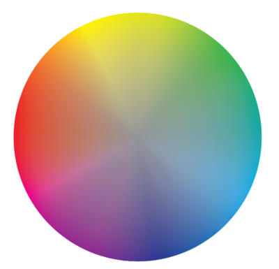
To visualise this, let’s substitute the colour wheel with a colour disc. The outside ring is the same, but as you go towards the centre the colours get mixed until they reach a neutral grey in the middle.
The strength of the basic colours lies in the absence of the others. When you mix two together, you still get a strong colour (green, orange or purple), but as soon as you add the third basic colour, the hue gets toned down.
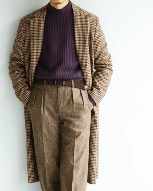
Most of the colours we use in men’s clothing combine well because they are not on the outer ring of the disc. Olive is green with a hint of red; khaki is yellow with some purple mixed in. A chambray shirt looks great with chinos because they both move a little towards the centre. Brown shoes can be worn with many colours because brown contains some parts of all colours.
By meeting on the inner spheres of the disc, we get colours that do contrast, but since they contain a part of all the others, the difference is nowhere near as strong as on the outside circle.
How much colour is there?
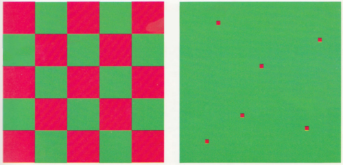
Another of the seven contrasts defined by Itten that can be useful is the one of quantity or proportion.
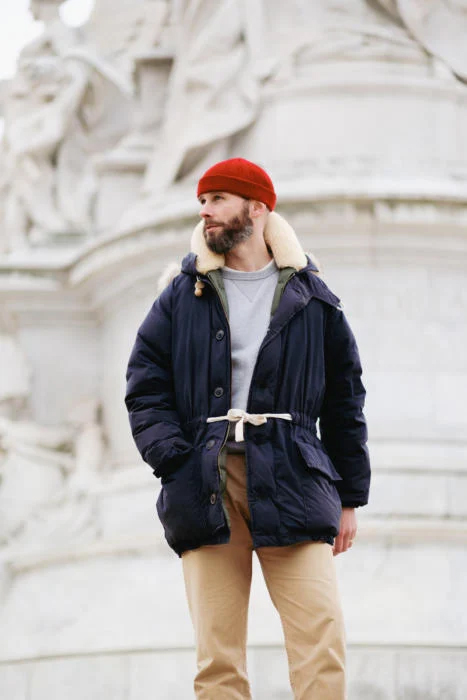
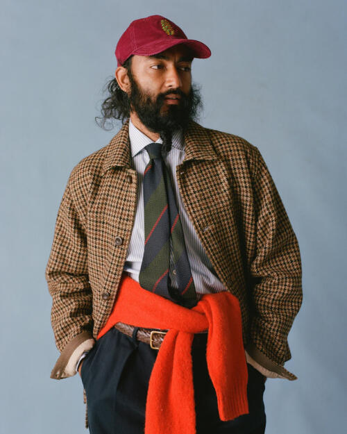
Two colour blocks provide a very different contrast when one is expanded or shrunken in size. In this way, you can usually get away with stronger hues. An olive-green Barbour jacket with Nantucket reds will be too much for most of us, but the same jacket with a bright red scarf or cap might still work. The infamous power tie is a good example for a contrast of proportion, too. Ties, socks, scarves, and caps are great ways to add colour contrast to an outfit.
Warm and cold enhance each other
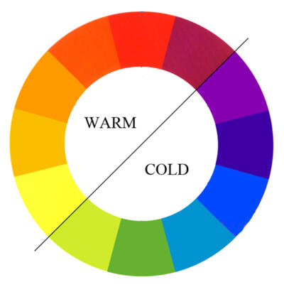
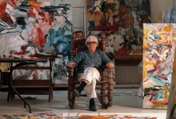
Warm/cold contrast is the last of the seven that I’d like to mention. When placed next to a colour, again of a similar lightness, a cold colour enhances a warm colour and vice versa. In painting, this is used quite frequently and, of course, it can be used in regards to clothing, too.
Sometimes this effect can enhance our personal appearance and skin tone. Being very pale-skinned myself, I look a lot healthier in a light blue shirt than a yellow one: the cold blue enhances what warmth I have in my skin tone.
Texture and depth
“Every colour can be described in terms of having three main attributes: hue, saturation, and brightness,” states the Pantone website, and being the developer of the first colour matching system that revolutionised designing and printing, they should probably know.
Of course, this is a rather abstract way of speaking about colours. Science defines hue as light of a particular wavelength, a part of the visible spectrum. To the artist, colour is the substance of a pigment or paint. Colour in clothing is more akin to artists’ tones.
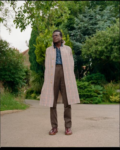
When applied as a dye to fabric, the effect differs from the theoretical due to factors such as texture, lustre, transparency and depth. A worsted navy suit looks distinct from even a very dark denim due to weaving, materials, and how these accept the dye. Although not emphasised by Itten, keeping these factors in mind is essential.
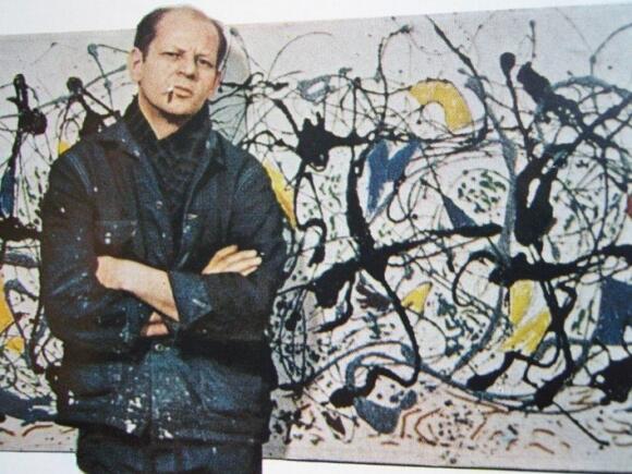
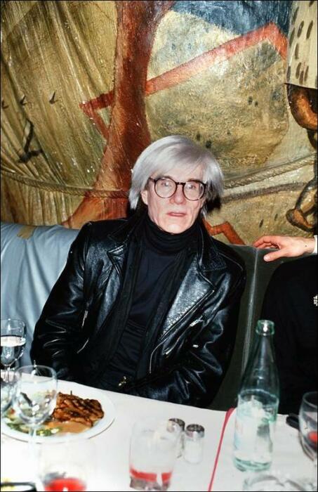
The associations of colour
An different level of colours worth remembering is the primarily psychological or sociological one. I’d call it the associative level of colours.
Pure red, for example, holds a special place as a less common colour in nature, and one often associated with attention-grabbing elements like flowers, fruit, meat, or dangers such as fire and blood. Such a highly signaling colour can be impactful but must be used with caution.
Clothes bring their own set of associations – think of red Louboutin soles, transforming a part of a shoe that has long been ignored into something exciting and commercially useful, when marketed to make women feel confident, passionate and empowered.
In a similar vein, I’ve always found purple challenging to use, being somewhat associated with the clerical, spiritual, or esoteric. Blue, suggesting distance as seen in the sky and deep water, is more versatile, though only when used in those shades of dark navy or light blue. Combining a true and strong mid-blue can still be a daunting task, as I’ve discovered while attempting to make my mid-blue Ebbets Field cap work.
Use patterns and texture
Another way to combine colours is through patterns. In the same way as pointillist paintings, patterns mix strong colours together to create a different effect when looked at from afar. It can be astonishing to see the vivid colours that make up a tweed cloth, while largely appearing as greenish or brown from a distance.
Effectively using and combining patterns can be challenging but also fun, depending on the specifics. Drake’s, with its sometimes anarchic mix of tweed, colourful rugby shirts and scarves, comes to mind. Instead of large colour blocks clashing, patterns create a blurry, overall more colourful image that is difficult to define, resulting in surprising combinations.
Sticking with neutrals
So, is there a recipe for success? One straightforward approach is to use mainly use neutrals – white, black, and grey – or adjacent neutrals such as taupe or brown shades. This is often referred to as tonal dressing, and you can find excellent examples in the lookbooks of Stoffa or Saman Amel.
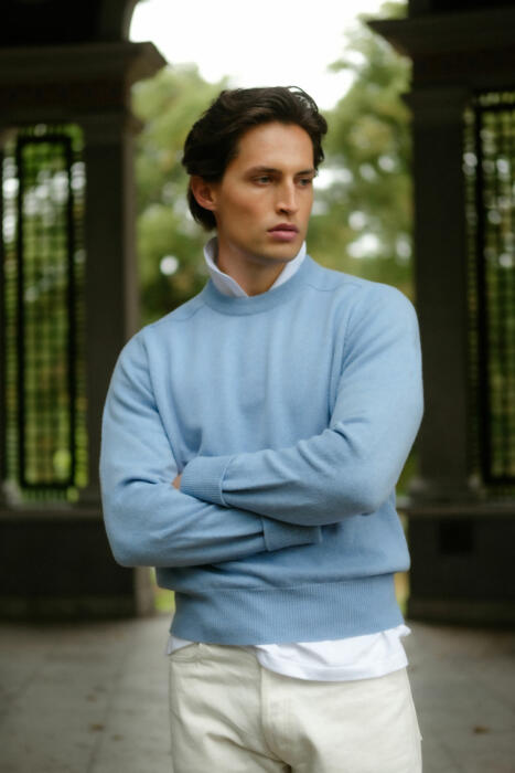
Adding just one colour to this is easy and can be striking, especially when combined with texture. Rubato above provides a good example: light, neutral trousers paired with a blue or yellow sweater, with a subtle repetition of white added as a collar, creates a purposeful and elegant combination (above).
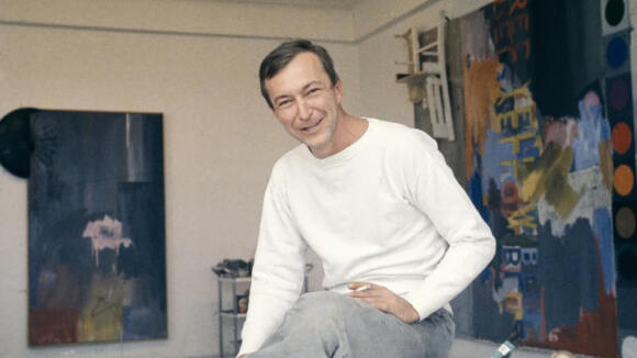
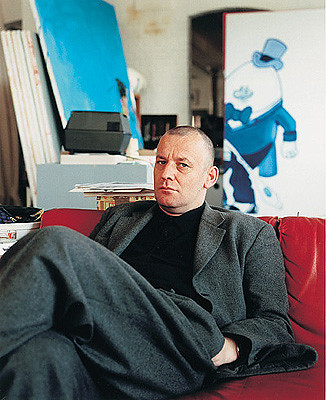
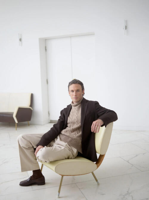
In the end, it all comes down to attitude. How do you want to present yourself?
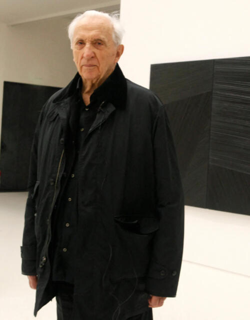
For an artist Hockney dresses in an individualistic way, standing out among the black-clad artists at gallery openings. Black, often considered rebellious and artistic from a traditional menswear perspective, has been prominently featured in lookbooks this year. It’s crucial to note that there are no inherently good or bad colour contrasts; there are only different effects and associations that may reflect upon the wearer.

.JPG)

